
7 Color Trends in Web Design for 2019
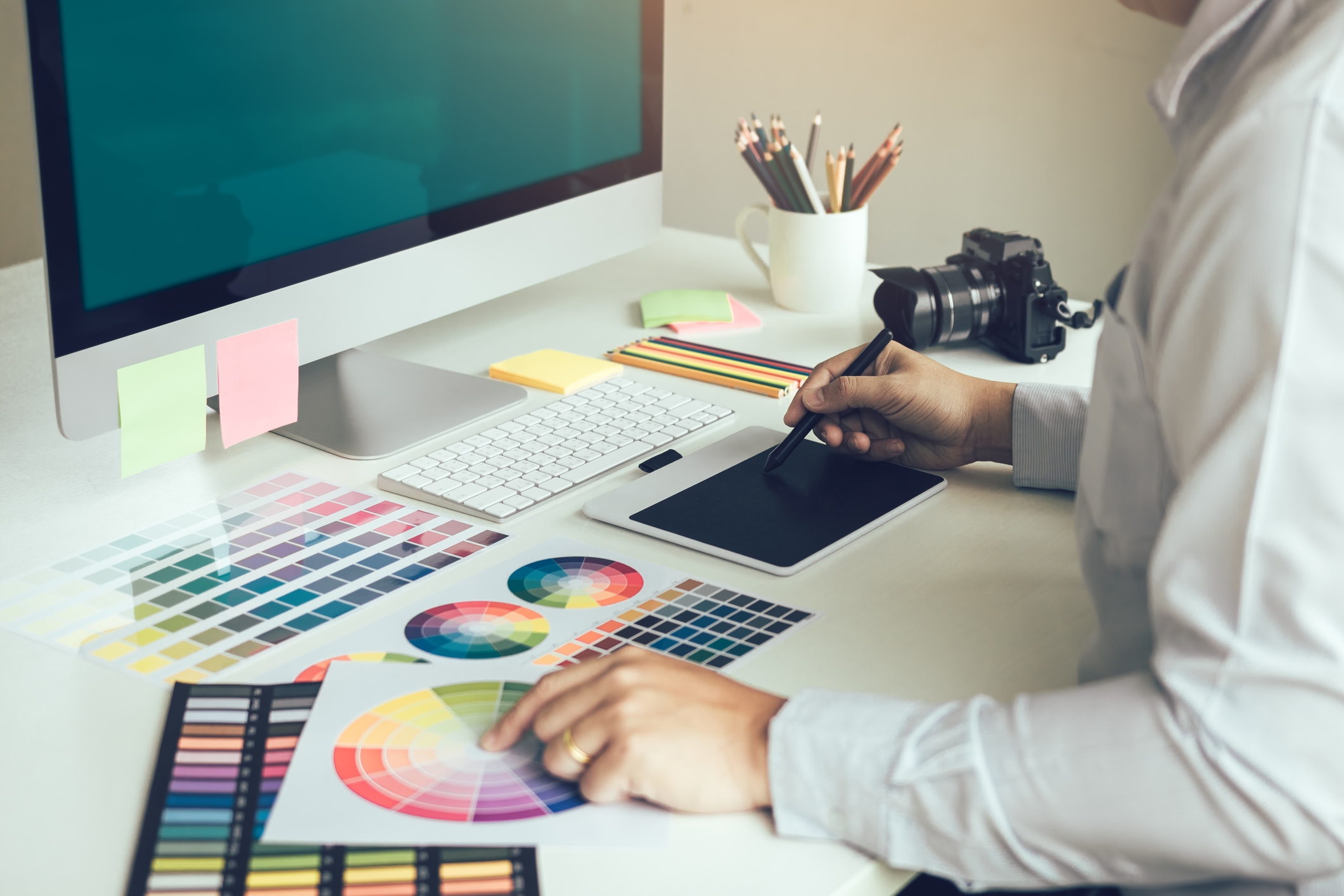
Everyone knows that color plays an important role for any website design. Color also reflects a form of brand expression. Thanks to technological advancements and devices, we can use richer colors, more bright shares and saturation levels that help adjust expressions previously unthinkable.
When it comes to color trends, there is some consistency through design disciplines in 2019. From bright, vibrant to punchy pastels and new neutrals, you can find the perfect colors for your future web design in 2019.
Let’s see the color trends that will reflect the aesthetic taste of people in their designs.
50 shades of pink
Pink has become more powerful than ever before. In 2016 Rose Quartz and Serenity were chosen as colors of the year. But it didn’t designate the peak for pink. It is expected that pink continues going mainstream and become one of the most versatile colors in 2019.
With vibrant, technicolor palettes you will see pink both as a bright color and an alternative neutral. Millennial pink is a new neutral paint color that meets gender, age and application boundaries. You should still expect an evolution and adaptation of the pink color. Here is a good example from Nika where millennial pink is center-stage on the homepage.
Metallics go neutral
According to the insights of Leatrice Eiseman, classic metallics have really crossed into being neutrals. Muted metallic can stand alone in contrast to neutral or soft shade. The use of metallics is really seductive on fashion design and interior as they can gleam brightly and harmonise with a wide range of design trends and color palettes.
Thanks to the difficulty of accurately showing them on the scress, metallics have proven that they really can make products and design look luxurious and sophisticated. Using this trend for visual brand design can raise the trending aesthetics in your industry. No matter what your design area, adding a touch of a new metallic neutral can make your design shine brightly in 2019.
Gradients
Gradients are coming back into web design. They are predicted to be one of the most prefered graphic design trend in this year. More and more designers are choosing color options with gradients in different forms like backgrounds, top coating, and illustrations.
The combination of the flat design movement with multiple shadows and gradients will help you improve user experience and functionality. Moreover, the new gradients have really beautiful and vibrant color passes. With plenty of gradient options, you can definitely find your perfect color palette in 2019.
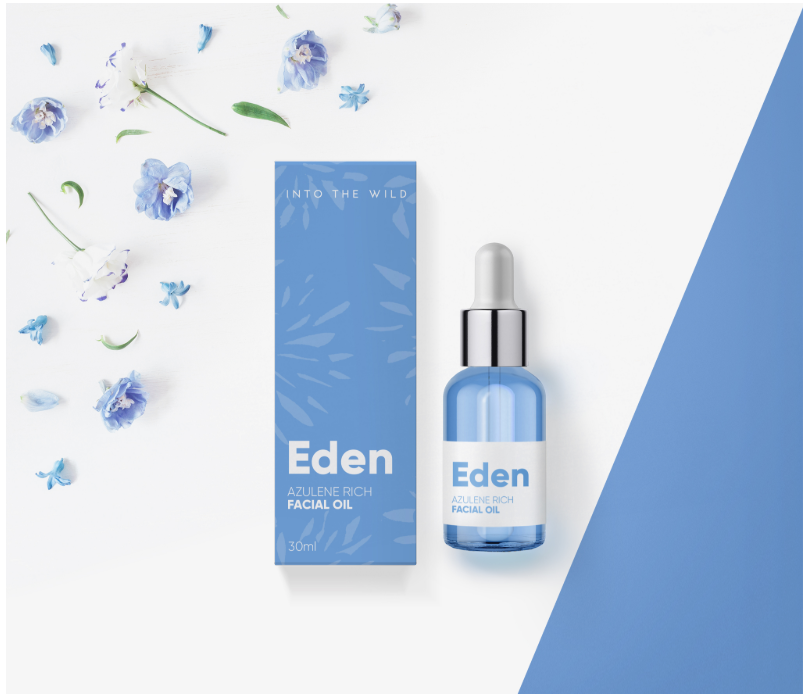
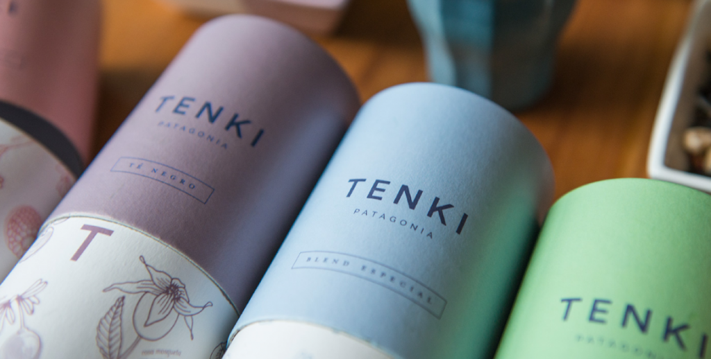
Pastels
Minimalism is a key value of Scandinavian style – less stuff, less color (mostly white colors) and less consumption. This hipster trend appeared prominently in media and graphic design, resulting in a rise of modern pastel colors. They include a wide rage of colors like magic mint, periwinkle, stormy blues, lavender, and etc. This kind of palette are often known as “farmhouse chic” because you can find these combinations in Scandinavian interior design with minimalist elements.
If you want to show some adventure in your design discipline, you can go for punchy pastels and candy colors. Shutterstock noted these colors as top 11 color trends you should use in this year. While black and white will be forever popular and classic colors, you can integrate minimalism into your designs using a wide range of pastel palettes.
Brutalism
Brutalism is going to be one of the leading color trends in web design this year. Color is a key component to make your website brutal. Brutal websites usually use intense colors, the rejections of current design ideals, color chaos and belittling schemes.
You should expect to view peculiar color palettes like unexpected layouts, oscillating and even jarring patterns, and oblique views that can create a memorable viewing experience. Make sure that the use of this trend can make your design unpleasant and even ugly, and hurt your users.
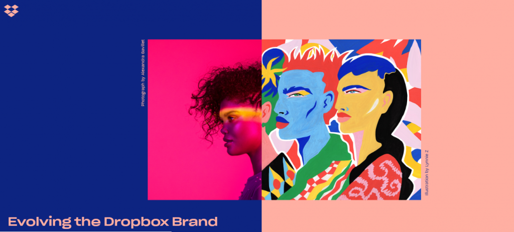
Similar to other web design trends, you can find a broader range of other colors resulting in avant garde style branding and the revival of rural craft for brands that want to show aesthetic anarchy and stand out from the crowd. Put it differently, either you love it, or you hate it, but implementing brutalism into your design will make a big splash around your brand. Take a look how Dropbox showcases the entity of brutalism through a bold color palette.
Summary
It would seem that 2019 is going to be an exciting and unforgettable year. With the plethora of so many color trends, web designers will scratch head over choosing a perfect color palette for their brands and demonstrate an aesthetic taste and color outside the lines a form of self-expression.
Try to carefully match colors for your website. Thanks to the color possibilities, you can create a memorable and beautiful site and brand for your visitors. Test everything, and you’ll do it!